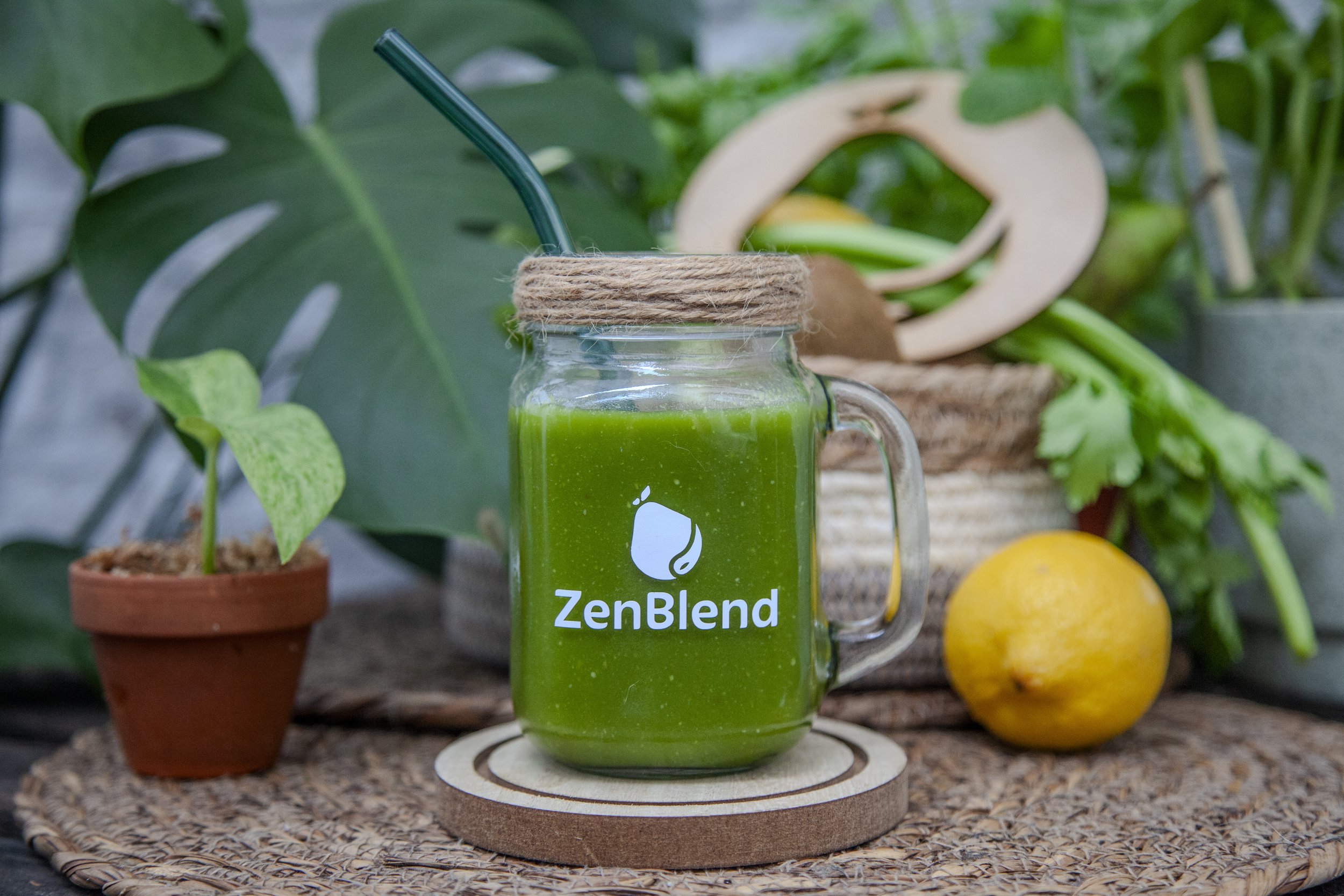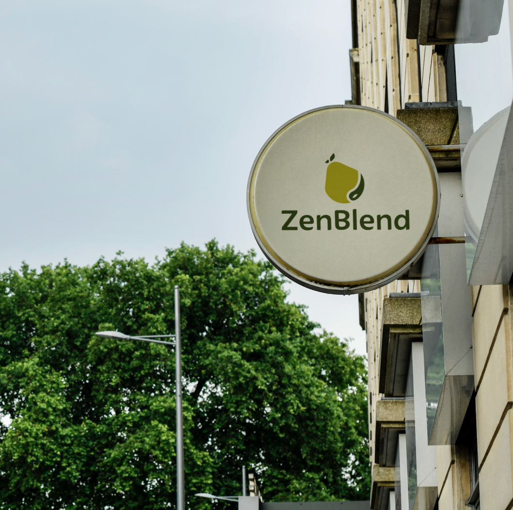
ZENBLEND — branding
ZenBlend is a smoothie bar branding project. The logo combines a pear, a juice drop, and a leaf into a single fluid mark — natural and minimal, but full of meaning. That same organic language carries through the stationery: scattered leaf shapes across the letterhead, envelope, and business card create rhythm and cohesion. A fresh olive green color palette keeps the whole identity grounded yet alive.